
Introduction
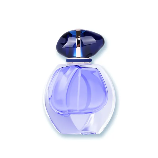
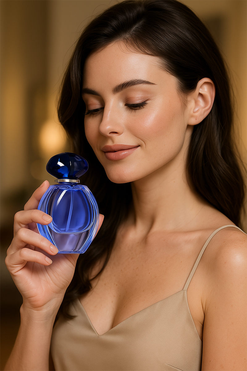
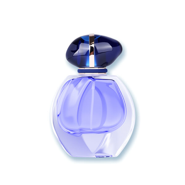
Picture a traveler pausing at a duty-free counter, thumb tracing the cool curve of a tiny flask as if it were a compass. The round perfume bottle catches the light, a simple circle that promises ease in the palm and calm on the shelf. For many brands, the 30ml round perfume bottle has become the quiet hero of first launches and gift sets. In recent seasonal audits and indie brand lineups, this size often leads starter SKUs—steady sell-through, low risk, easy to ship. Yet a small shape hides big trade-offs: atomizer feel, neck finish tolerance, and true shelf presence (no small matter). So here’s the real question: why do some tiny round bottles feel effortless, while others slip, fog, or dribble at the crimp?
I’ve seen teams overbuild a base and still miss grip; I’ve seen light walls survive a drop test. The pattern is not luck. It’s design logic—tested, adjusted, and measured. If we compare choices rather than follow myths, the curve starts to make sense. Let’s step into that comparison, and see what actually moves the needle.
Hidden Friction in the 30 ml Round
What problem hides in the curve?
Technical view first. The 30 ml form looks neutral, but mass and touch are not neutral at all. Center of gravity shifts with a heavy base, and that changes grip and slip. A curved label warps type at the seam; a thick wall can cut shelf “blocking” by shrinking the visible logo face—funny how that works, right? Atomizer feel rides on tolerance stack-up: neck finish ID, collar crimp, and gasket fit. If the crimping head bites too soft, you get weeping. Too hard, you crush the rim or raise micro-cracks. The glass leaves the annealing lehr sound, then a bad crimp ruins it at the last mile. Soda-lime glass is standard for fragrance, but its edge strength needs kind handling; drop test outcomes are as much about shoulder geometry as about wall thickness. Look, it’s simpler than you think: small changes to radius, shoulder slope, and knurling on the cap can cut real-world slip without a mass penalty.
Traditional fixes often miss the mark. “Premium equals heavy” is one. A tall, thick punt seems luxurious, but it can make the bottle top-heavy once the metal collar and cap go on. Then the atomizer plumes unevenly because the bottle angle in use shifts—awkward. Another common patch is to push frosting or lacquer coating to add grip; that helps touch, but may complicate silkscreen registration and raise reject rates. Labels on a tight curve curl at the edge unless the adhesive and facestock are tuned; many teams learn this only after a humid chamber test. Volumetric tolerance also matters: that “30 ml” needs not just fill accuracy, but headspace tuned to the pump’s dosage, or your EDP feels weak on the second week. Solve the right problem—cap torque, crimp quality, and neck finish spec—before you pour glass into the base. Weight is a blunt tool.
Comparative Signals and What’s Next
What’s Next
Forward-looking, the best moves now blend simple physics with tighter inspection. A capable round perfume bottle supplier can share SPC charts on neck finish diameter and rim flatness—numbers, not guesswork. Inline vision systems flag ovality before pallets close. Laser profilometry maps shoulder radius so the atomizer sits true; no tilt, no hiss. On the decor side, low-solvent lacquer with UV curing cuts cure time and keeps COF stable for grip without tack. Want sustainable weight without “hollow” feel? Use a slightly wider shoulder radius with a modest heel thickening, paired with PCR glass in a controlled mix. It passes the drop test, reads premium, and lowers cradle-to-gate load. The principle is steady: design for the hand first, then for the line—then for the photo. In that order. Not magic, just method.
Now, how to choose? Think in three metrics that compare options cleanly. 1) Hand and spray performance: measure coefficient of friction on cap and base, plume geometry, and dosage repeatability across five angles. 2) Manufacturing proof: ask for Cpk on neck finish diameter, crimp leak-rate data after 24-hour thermal cycling, and annotated reject codes—no vague “line loss.” 3) Brand presence per gram: shelf-blocking width vs. mass, plus label legibility on a 1.5–2.0 mm curvature. You can add MOQ, lead time, and rework policy if you want the full dashboard—but start with those three, and you’ll see real differences fast. Keep the curve honest, and the bottle will serve the story it holds. For further reading and quiet benchmarking, see NAVI Packaging—they share process details that help teams ask better questions.